MAERETdesigns -
designs with merit -
MAERETdesigns - designs with merit -
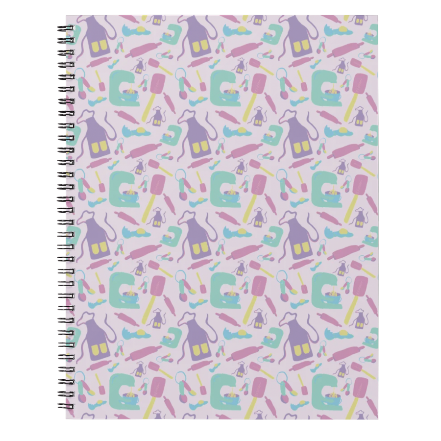
Pattern Design
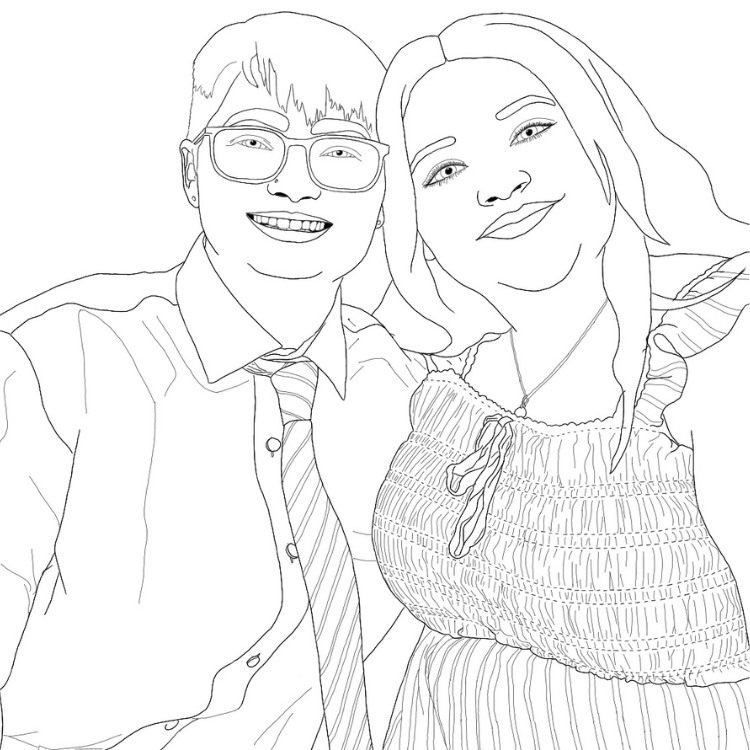
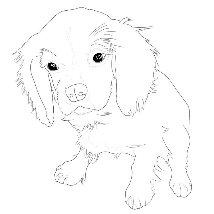
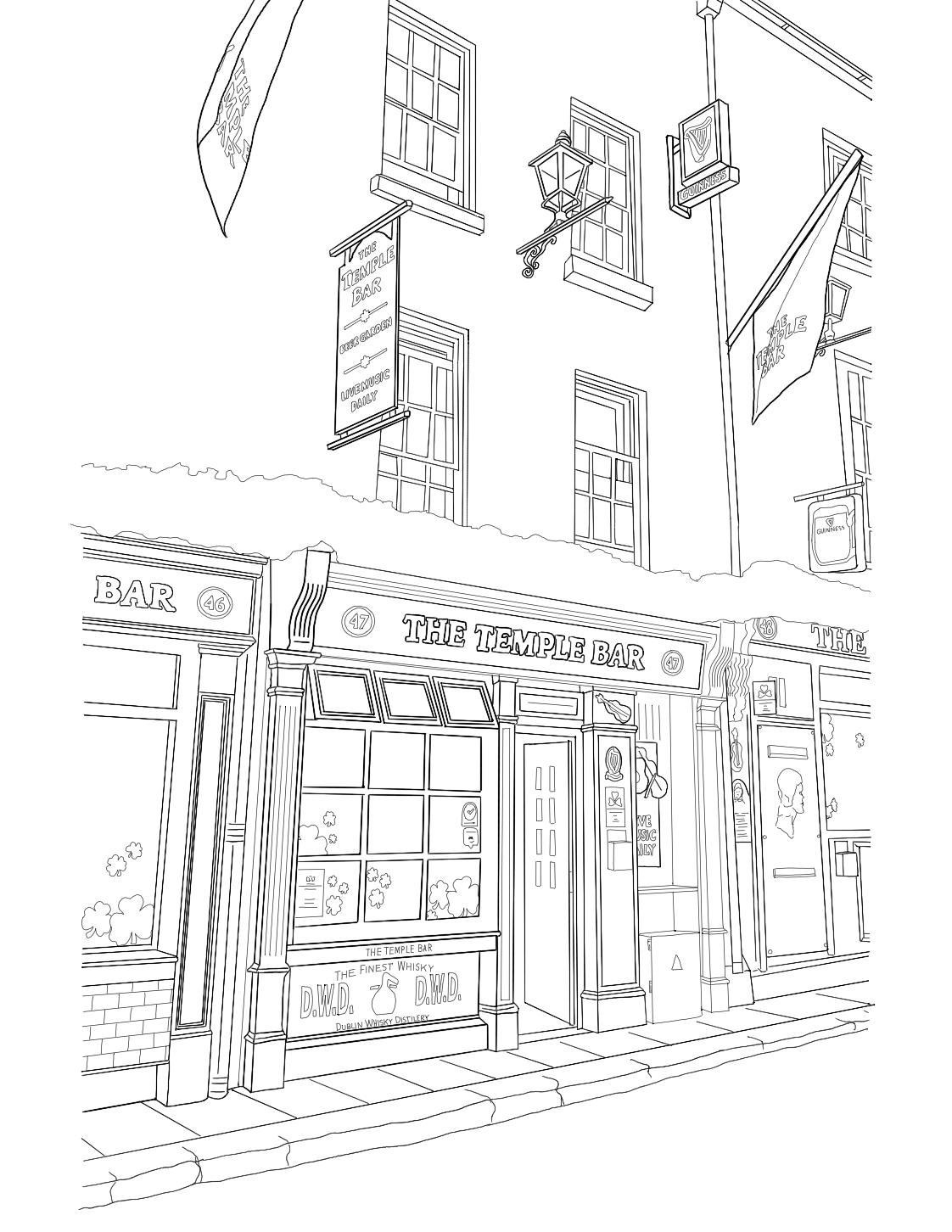
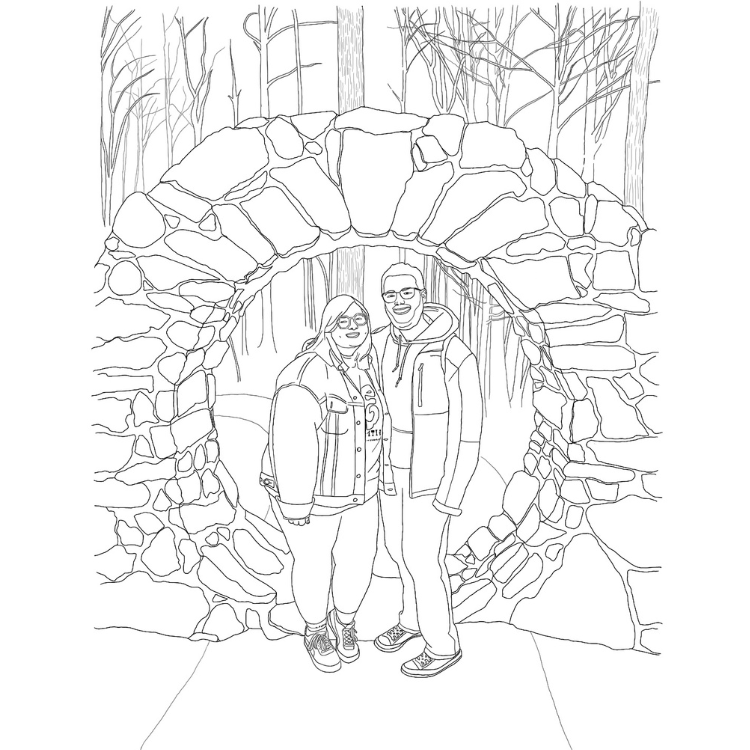
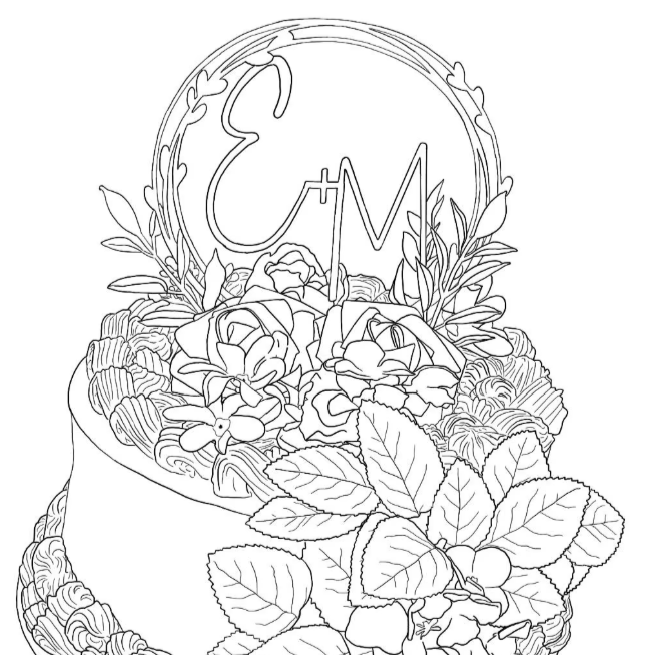
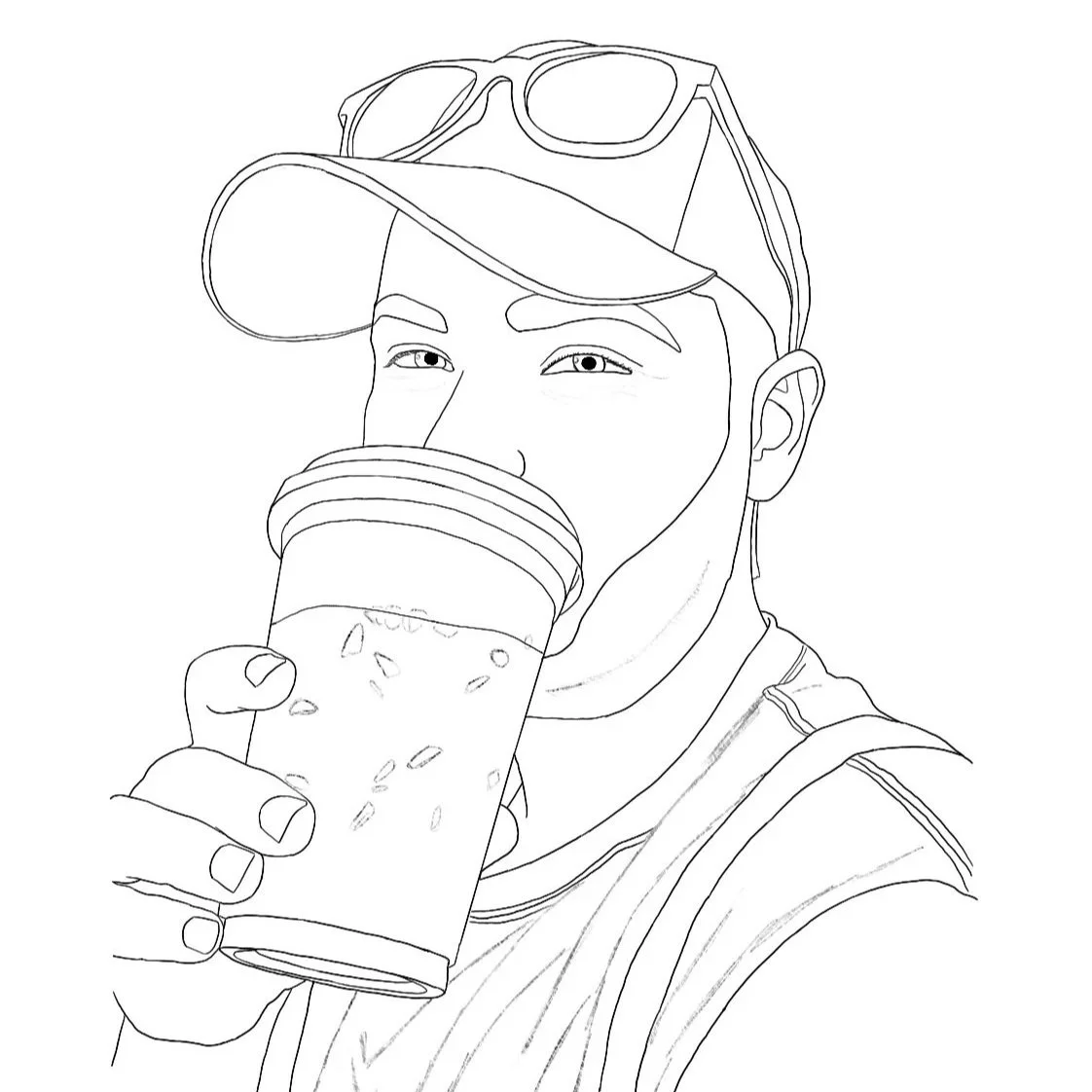
Made-To-Order Colouring Pages
Advertising Campaigns
WWF - Palm Problems
for educational purposes only
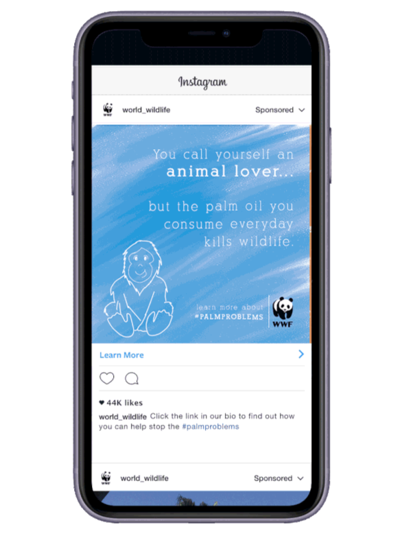
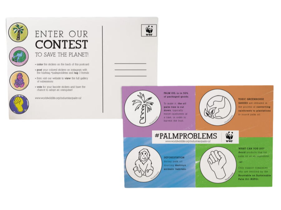
This campaign for the World Wildlife Foundation focuses on calling attention to the issues surrounding the palm oil industry. Scroll to learn more about how your daily decisions impact the world we live in, and make sure to share your findings with #palmproblems
Lactaid - Dare To Dairy
for educational purposes only
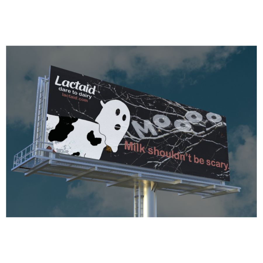
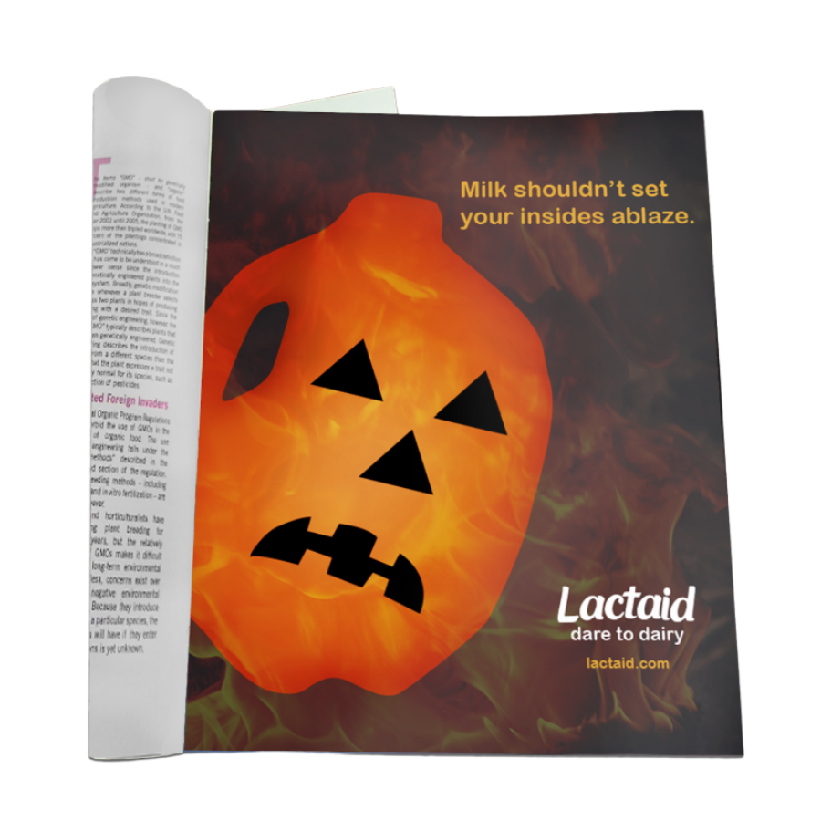
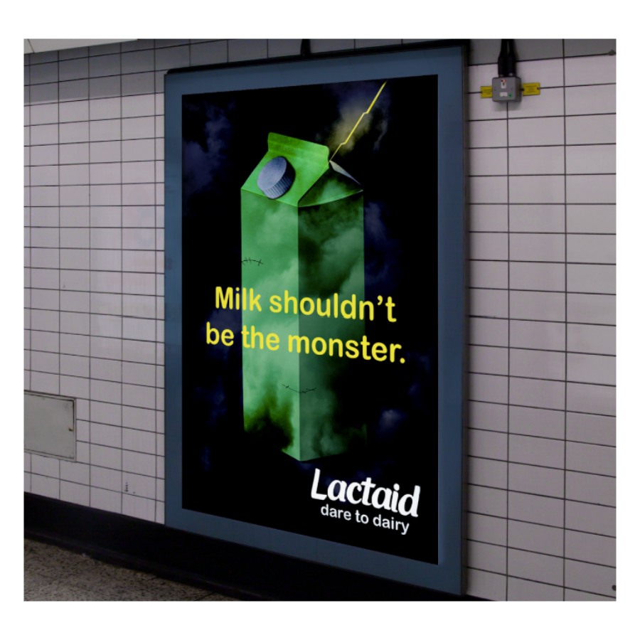
In this Halloween-themed series, the horrors of lactose intolerance are reflected in a fun, light-hearted manner. Aided by visuals of milk cartons and dairy cows, the copy is the driving force in this campaign. With the tagline “Dare to Dairy”, viewers can conclude that the product will alleviate and even eradicate their ailments, allowing them to continue enjoying their favorite treats.
Branding
Daily Stars Astrology
Target Audience
Daily Stars Astrology aims to reach a diverse audience beyond age and gender lines by connecting with a deeper, more intuitive version of oneself. It strives to find curious minds in search of truth, meaning, balance, peace, and answers to life's big questions.
Brand Voice
The brand's overall tone is intended to feel familiar, much like a gentle guiding hand that inspires and empowers potential customers. The tone of voice used by this brand is strategically direct in order to convey clarity.
Logo Design
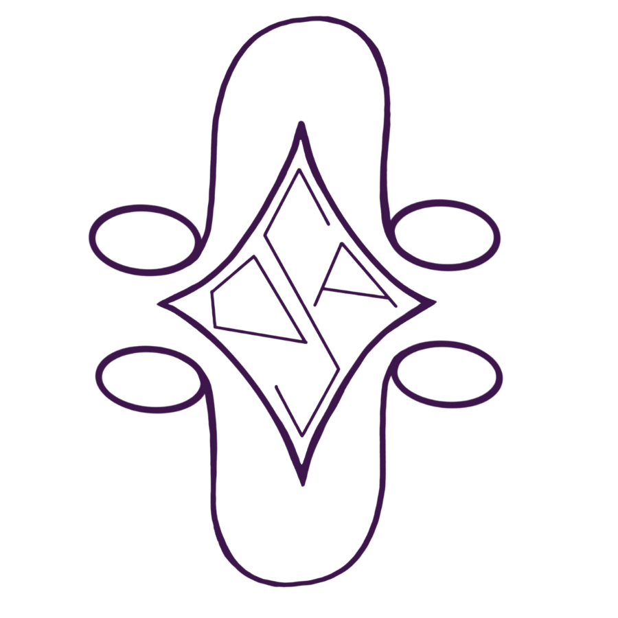
At the heart of the logo for Daily Stars Astrology is the company's acronym (DSA) inside a star; a nod to the fact that the company is astrology-focused.
Above the star is the astrological symbol of the North Node, which represents the future, the unknown, and the direction in which one is headed.
Below the star is the South Node, which is symbolic of the past, the familiar, and the places in which one has already been.
The company primarily utilizes the colour #3d164b in its branding, as purple is a color often associated with the metaphysical realm.
Rooted
Brand Voice
Rooted is a native plant festival that aims to educate people to know that they can make a difference in the world. It strives to do this in an easy-to-digest manner that is appropriate for all ages. It should feel casual and fun, as if talking to a friend- or a friend's child! With the archetype of Activist, Rooted is all about making positive changes and helping others to do the same.
Logo Design
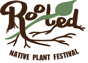
The Rooted logo is traditionally shown in all brown, except for the green stem and leaf that cross the letter t. The Rooted logo should be used in color whenever possible.
Rooted strives to respect its roots, and the roots in their logo are no exception! In order to remain legible, the primary Rooted logo should not be produced smaller than 1.5 inches wide. When representing Rooted on a smaller scale, an approved logo variant should be utilized.
Approved Logo Variants
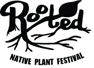
Rooted prefers that the full standard version of the logo is used whenever possible, but this is not a hard-and-fast rule. Whatever version of the logo is utilized, it should make sense in the environment and bring beauty to the brand.
Logo Clearspace
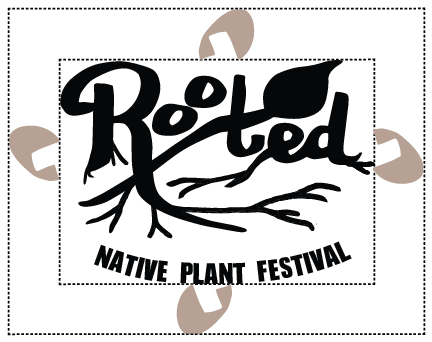
The Rooted logo should have room for its roots to stretch! Specifially, the counter of the R must be able to fit around the entirety of the Rooted logo.
Target Audience
Rooted refers to its event-goers as their "Saplings, Sprouts, and Seeds of all sizes". The largest population of Rooted's attendees are plant-lovers, but they also attract a large crowd of those who simply stumble upon the event. Whoever you are, whatever your walk of life, Rooted welcomes you!
Rooted is a family and pet-friendly event. They especially hope to inspire young people beacuse they will be the ones to carry what they learn at Rooted into the future.

Brand Assets
The assets pictured here are each created from elements of the Rooted logo. These images should not be altered or recreated in any way. However, they may be resized, combined, or have colors changed to any of the colors associated with Rooted.
Typefaces
Avenir Next Condensed Heavy & Avenir Next Condensed Heavy Italic
This is Rooted's secondary typeface. This font appears in the logo, so it is very important to the brand. Its weight helps set a foundation for roots to be planted, but it should not be overused.
Avenir Next Condensed & Avenir Next Condensed Italic
This is the brand's san serif font, used because of its clean look and feel. It should be used primarily for headlines.
Marion Regular, Marion Regular Italic & Marion Bold
This is Rooted's secondary typeface. This font appears in the logo, so it is very important to the brand. Its weight helps set a foundation for roots to be planted, but it should not be overused.